Partner Portal
WORLDPAY | 2018
Partner Portal is a one-stop online dashboard for Worldpay Partners to access financial info, manage customer referrals, and track support tickets.

Project Overview
Title: Partner Portal
My Role: UX Lead (Design & Research)
Team: Product Manager and the Dev Team
Duration: 6 months
Impact: Previously, partners juggled multiple tools and manual processes, leaving them disorganized and wasting time on paperwork instead of focusing on business growth. The redesigned Partner Portal consolidated everything into one platform with proper organization and information hierarchy.

Context & Problem Definiton
Background: When I joined, Partner Portal’s MVP had launched without UX input. As UX Lead, I partnered with product and development teams to pivot the interface into a more user-friendly design
Target Users: Worldpay’s Strategic Partners
Problem Statement: How do we create a better organized portal that effectively communicates with Partners?
Constraints: When I joined, Partner Portal’s MVP had already launched without UX input so I tackled a redesign
Research & Discovery
Methods: Heuristic Evaluations, User Acceptance Testing, and Beta Testing
Key Insights: My research showed that information hierarchy was lacking and would be the key to resolving most issues on the Partner Portal
Impact on Direction:
Redesigned the information hierarchy
Validated usability with customers
Updated the interface to align with Worldpay brand standards.
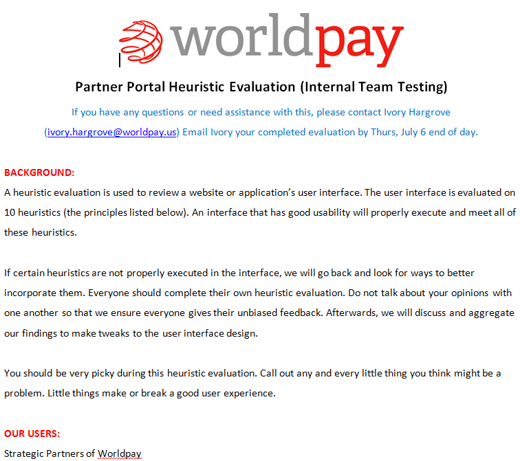
Phase 1 – Heuristic Evaluation
The Partner Portal MVP was evaluated by our internal team against 10 heuristics while walking through its four core tasks: viewing earnings, referring leads, submitting support tickets, and accessing financial reports
The 10 heuristics the interface was evaluated on are:
Visibility of system status
Match between system and the real world
User control and freedom
Consistency and standards
Error prevention
Recognition rather than recall
Flexibility and efficiency of use
Aesthetic and minimalist design
Help users recognize, diagnose, and recover from errors
Help and documentation
1. Pre-Exploration Questions
I explored Partners’ ideal portal experience and mental models, focusing on how they prefer to view earnings, submit leads, and manage support tickets. We asked about priorities upon login, current processes for tracking residuals/fees/tickets, pain points, time and stress levels, satisfaction, and expectations for the new portal.
2. Exploration Instructions
Beta testers were asked to: launch the portal from the welcome email, log in, view financials, refer and track leads, submit and track support tickets (including chat), and recover a forgotten password.
3. Post-Exploration Questions
We asked partners about unmet needs, whether the portal addressed them, and what would impress them. Feedback covered likes, dislikes, most exciting features, desired additions, and what they looked forward to using. We also explored interest in performance insights by partner devices.
4. Net Promoter Score
We asked Partners, on a scale of 0-10, how likely is it that you’d recommend this Partner Portal you just saw to other strategic partners? Please explain why you’ve given that score.
5. Next Steps
Lastly, we asked participants to compare the Partner Portal to their current distributor statements and email us feedback on whether it provided sufficient financial insight.
Phase 1 – Heuristic Evaluation
Rather than focusing on visual appeal, I led a heuristic evaluation of Partner Portal with three teammates, consolidated findings into recommended interface changes, and handed them to the product manager for backlog prioritization
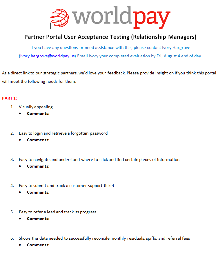
Phase 2 – User Acceptance Testing
To ensure a smooth launch, we first conducted UAT with six Relationship Managers — who serve as liaisons to Partners — to catch issues early before rolling out to actual Partners
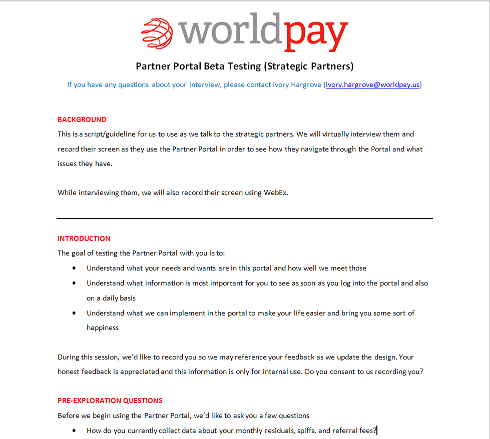
Phase 3 – Beta Testing
After refining the Partner Portal, we rolled it out to a pilot group of Partners before full launch in order to test it and incorporate their feedback into ongoing updates
Phase 2 – User Acceptance Testing (UAT)
Relationship Managers tested the MVP with real customer data, flagged discrepancies, submitted defects with reproduction steps, suggested improvements, and identified unmet Partner needs
UAT consisted of two parts - closed questions (image to the right) and open-ended questions (listed below):
First impressions of the portal
Expected partner reactions
Excitement to share/recommend
Whether it provides enough info to replace other sources (and why/why not)
Potential areas of confusion
Missing information partners might need
Clarity of visuals and text
Suggestions for additions, removals, or redesigns
Desired changes in how tasks/data (e.g., tickets, leads, graphs) are handled
Phase 3 – Beta Testing
Beta Testing consisted of five parts (script below) with the goals of: identifying user needs, determining the most important daily information, and exploring features that simplify workflows and improve satisfaction.
Ideation & Design Process
Initial Designs (that I was tasked to redesign)
The MVP of the interface I was introduced to lacked an important thing - hierarchy. When users landed on a page, there was no visual indication of what the most important information was.
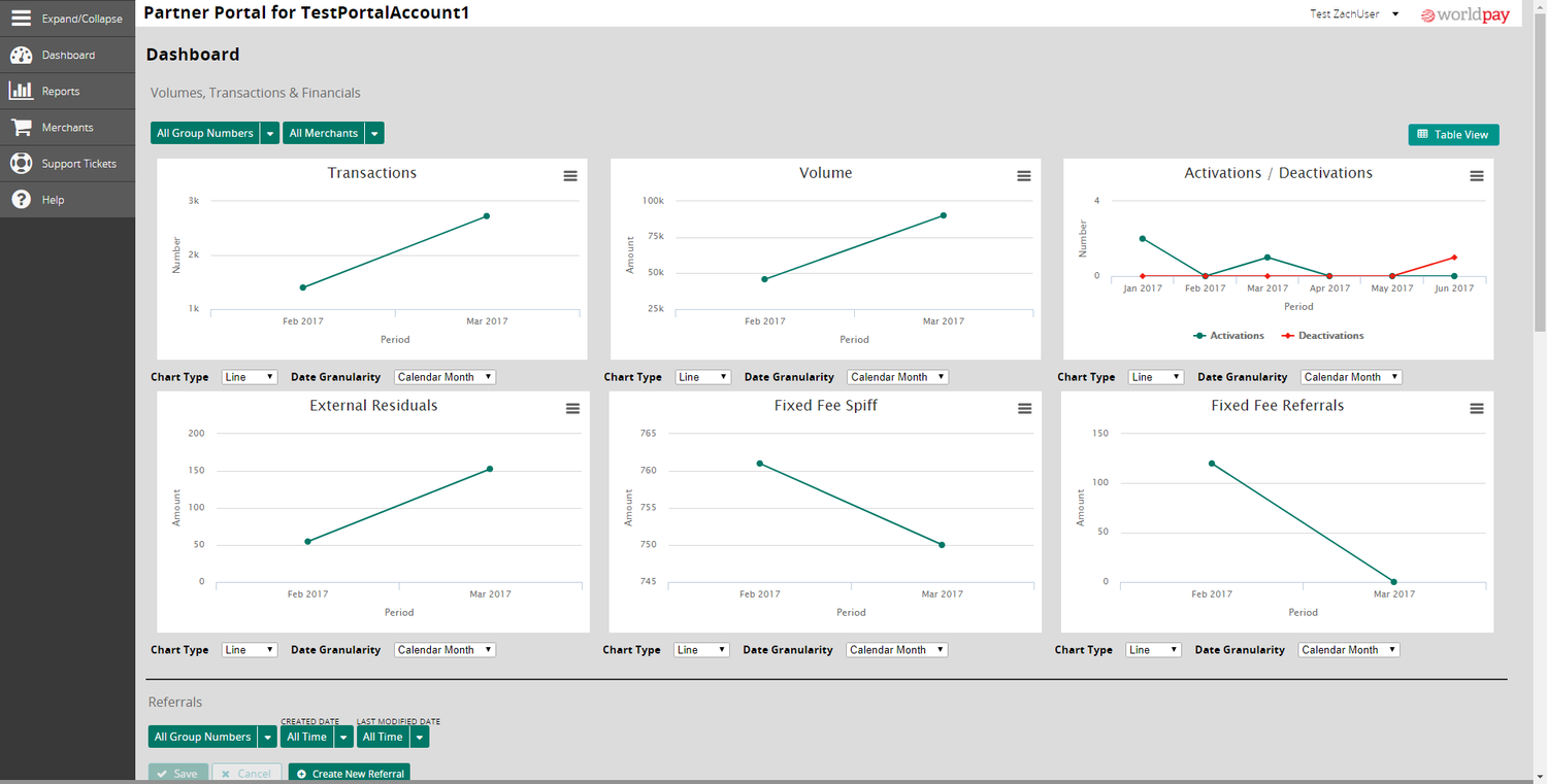
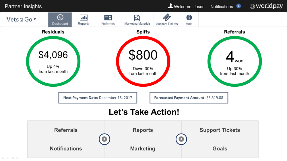
Dashboard
The Dashboard, meant to give partners a clear overview with drill-down options, instead overwhelmed them with a data dump.
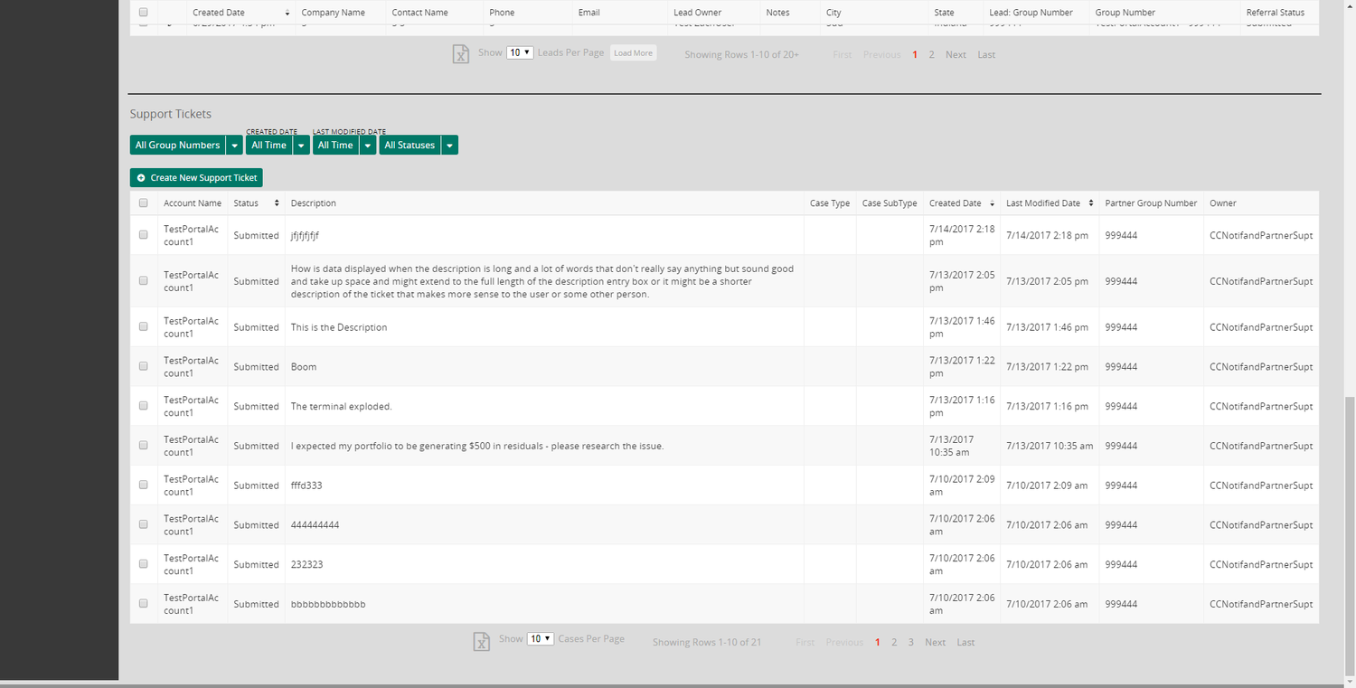
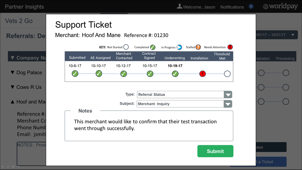
Support Tickets
The Support Ticket page made tracking ticket status difficult.
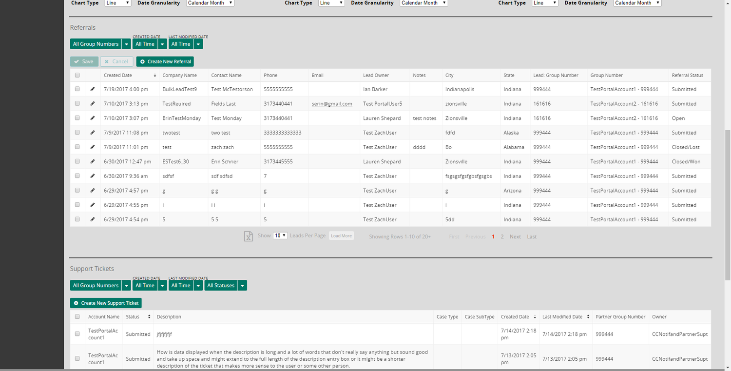
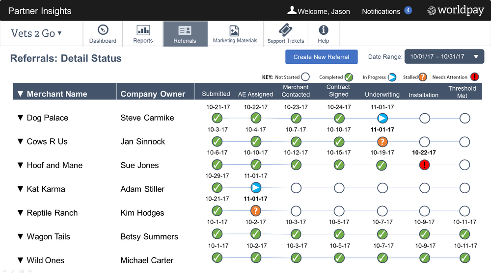
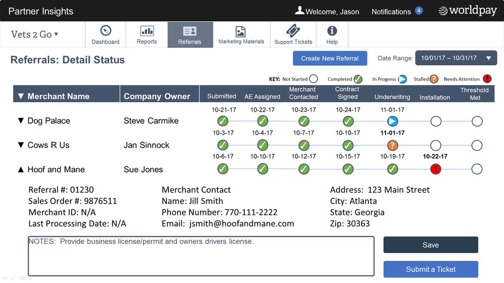
Referrals
On the Referrals page, tracking was confusing — the status was buried in the last column and failed to stand out.
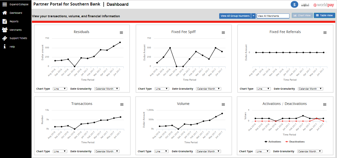
We added clear left-side navigation, emphasized graphs for clarity, and reordered them by importance.
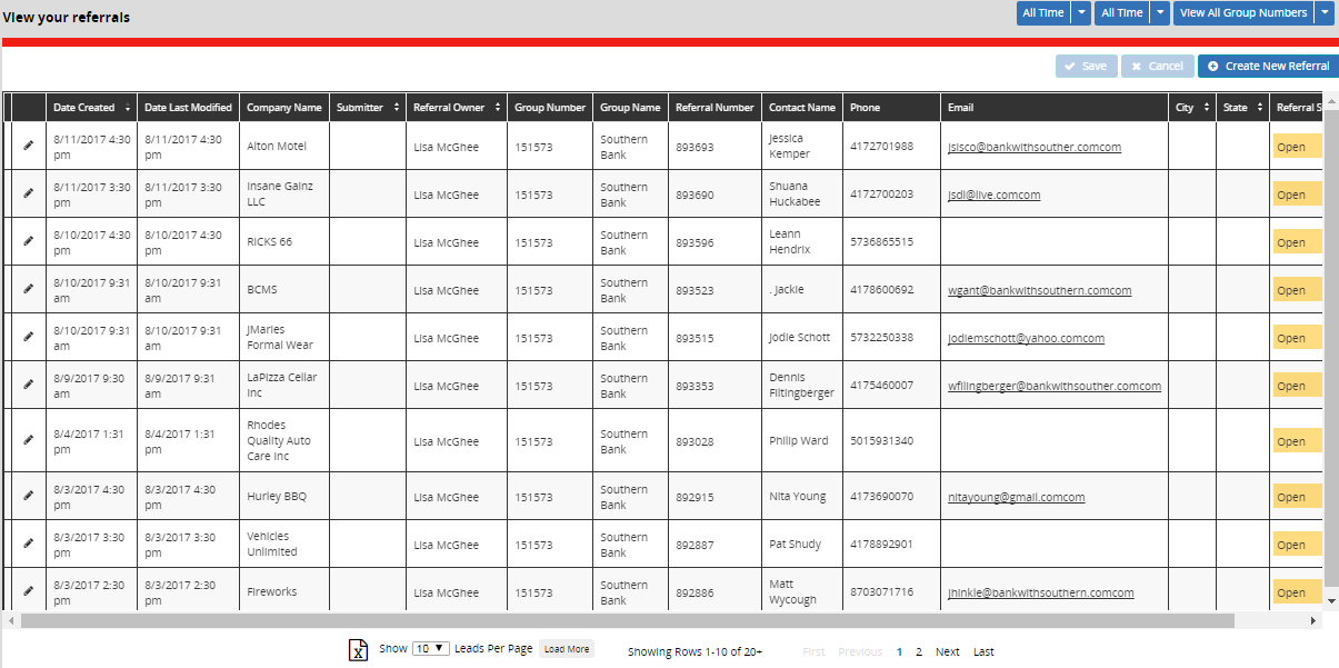
The new color scheme improved table readability, with referral statuses highlighted through color coding.
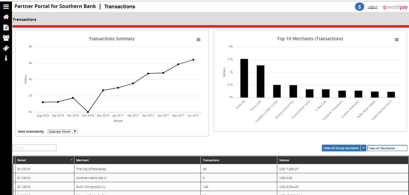
A page for detailed transaction info, moving data previously limited to paper statements into the online portal.
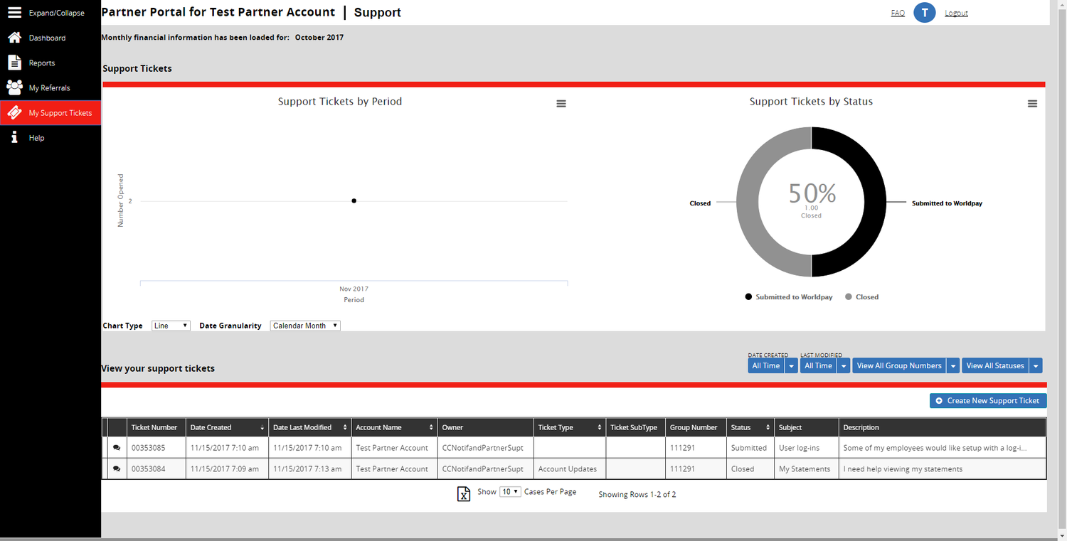
Detailed info helps partners track ticket progress and recurring issues without relying on their RM.
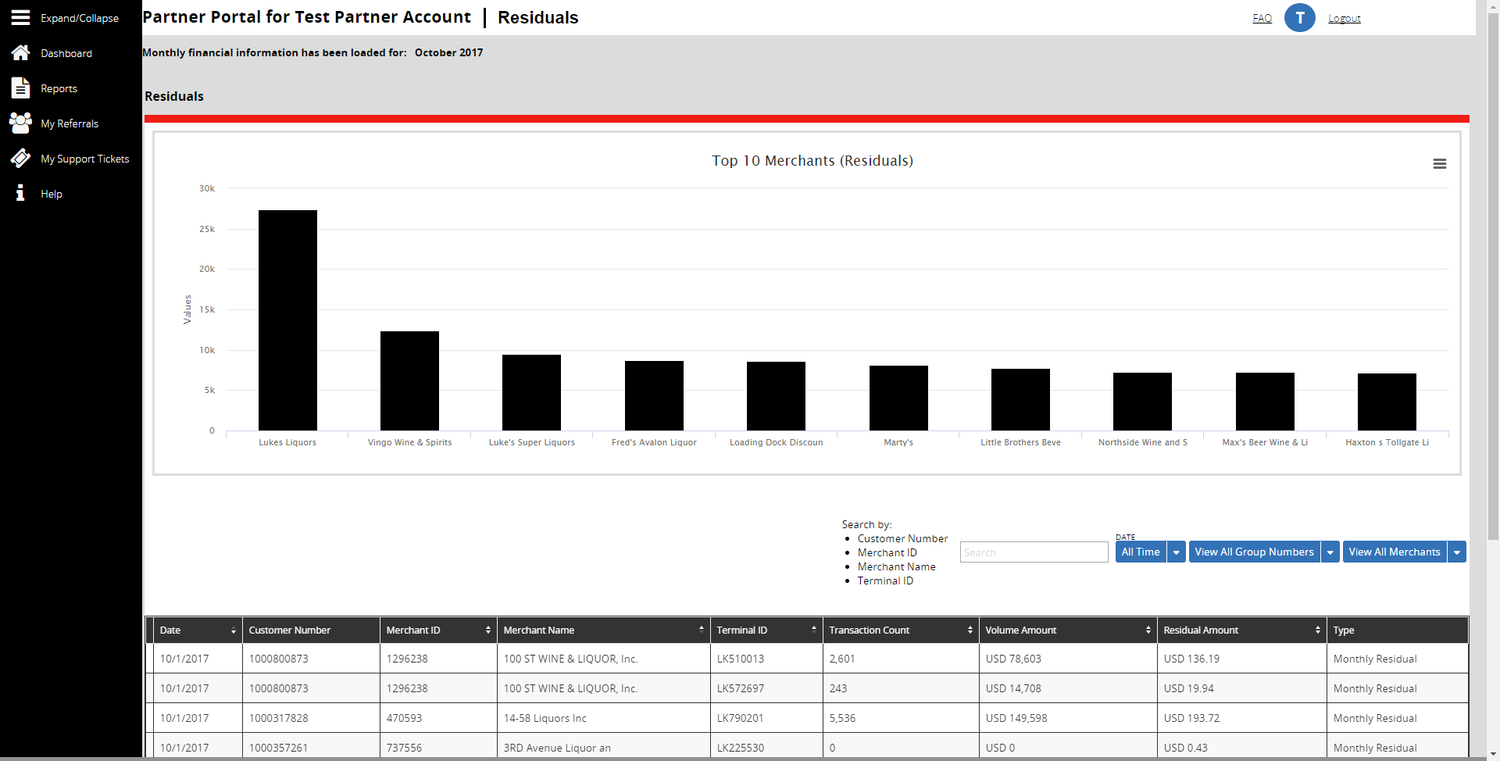
A new page for detailed residuals, bringing information previously limited to paper statements into the online portal.
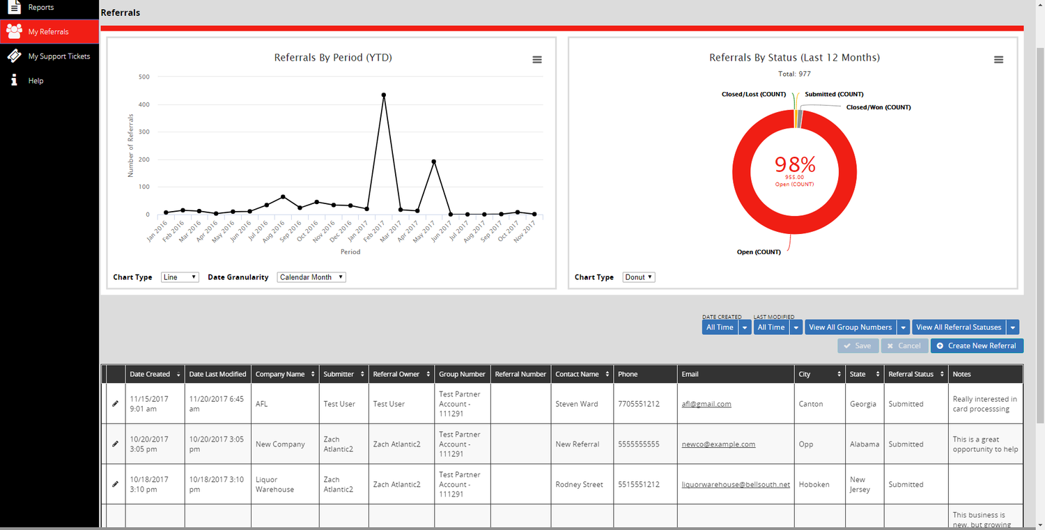
A detailed page was created to track where their leads are in the process
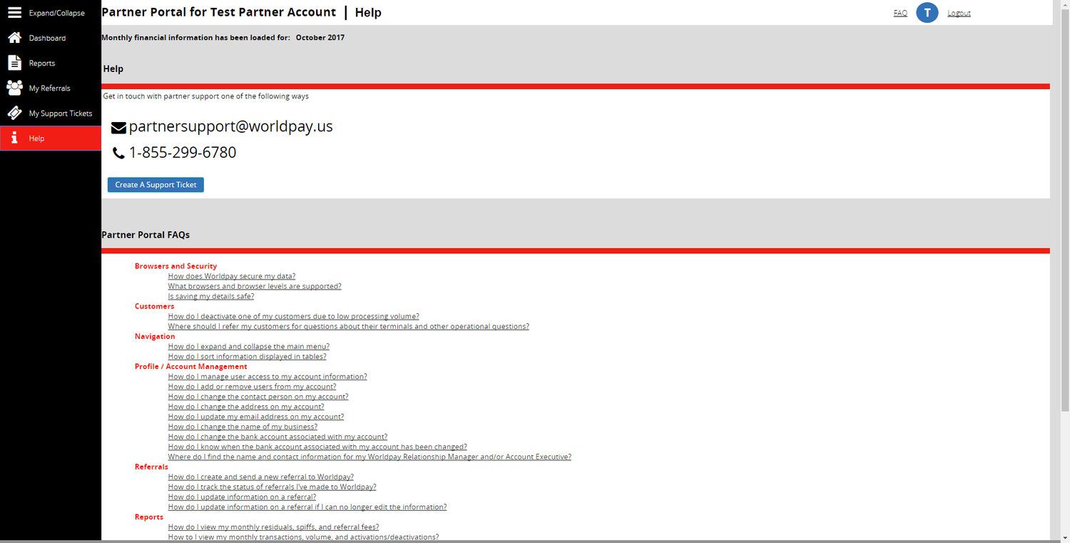
A Help page with quick contact info and an FAQ section based on common testing feedback, replacing the need for partners to track this information themselves.
Google Venture Design Sprint
Although the redesigned Portal was well received, I saw room for improvement and led my company’s first Google Ventures Design Sprint. In five days, we identified core issues, explored solutions, and produced a quick prototype for testing.
The final prototype delivered at the end of the Sprint is below - along with the questions we tried to answer with each part of the redesign.
Welcome email feedback focused on first impressions, clarity of purpose, expectations for ‘Partner Insights,’ next steps, and overall tone.
Login page
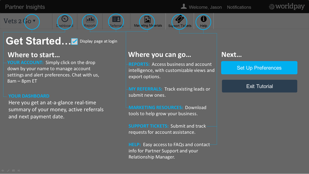
Onboarding questions covered first-login expectations, usefulness of a tour, desired tour content, clarity of layout and callouts, first impressions, and reactions to the ‘Next’ section options.
Dashboard feedback focused on page purpose, layout, visual hierarchy, key information, consistency of content, clarity of data, missing elements, and reactions to sections like ‘Let’s Take Action,’ notifications, and payment details.
Merchant status feedback covered clarity of details, understanding of ‘needs attention now,’ next steps to resolve issues, and comfort with submitting a ticket online.
Support ticket feedback explored next steps after seeing pre-filled info, sufficiency of autofilled merchant data, and clarity of fields like ‘type’ and ‘subject
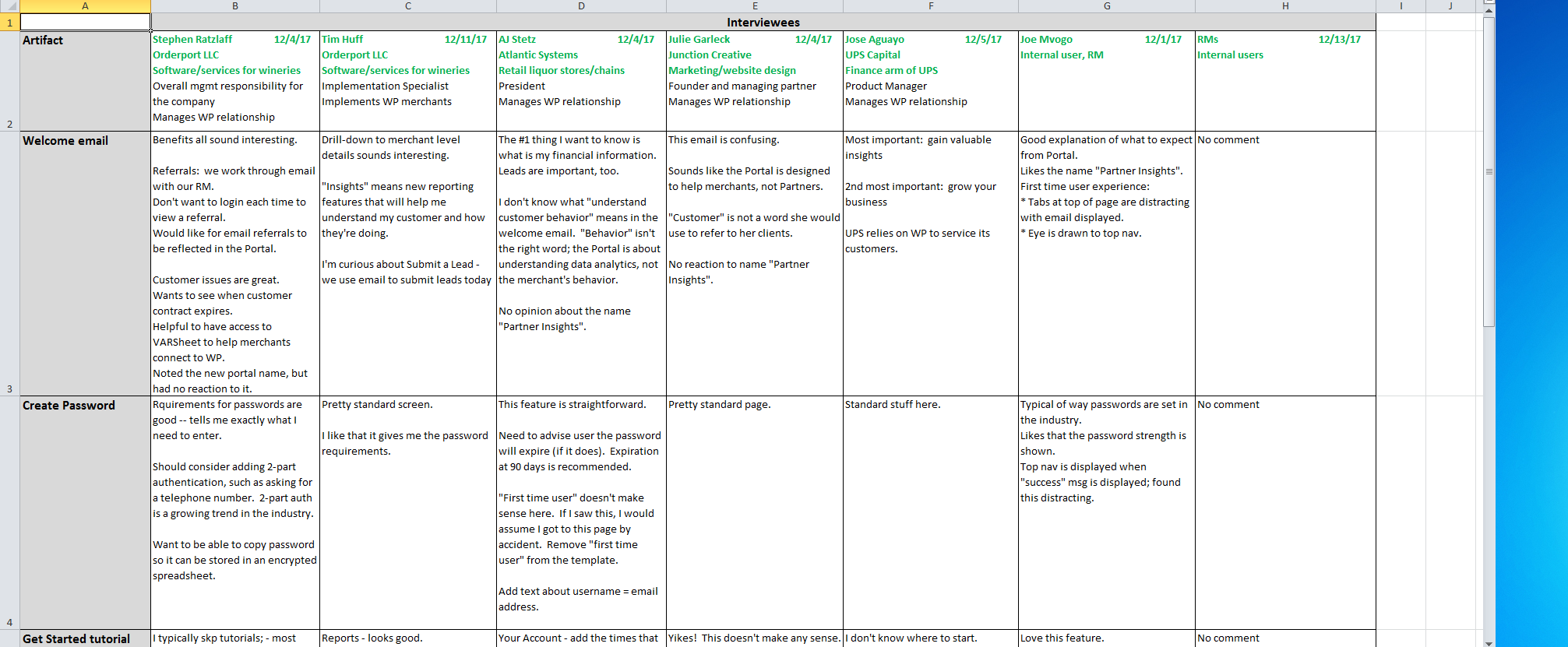
From 6 design sprint interviews, I synthesized common findings to prioritize next steps
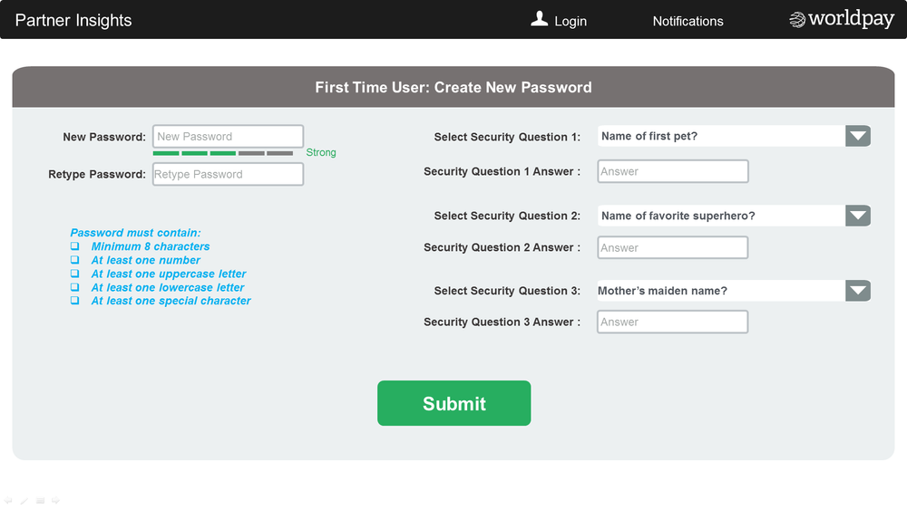
First-time user feedback explored overall impressions and comparisons to other onboarding experiences.
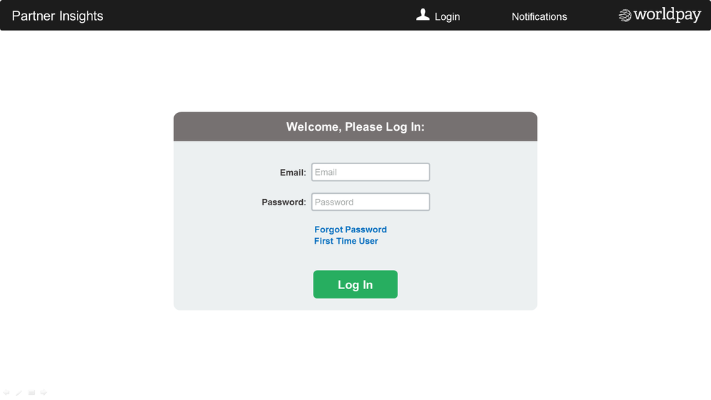
Successful login page
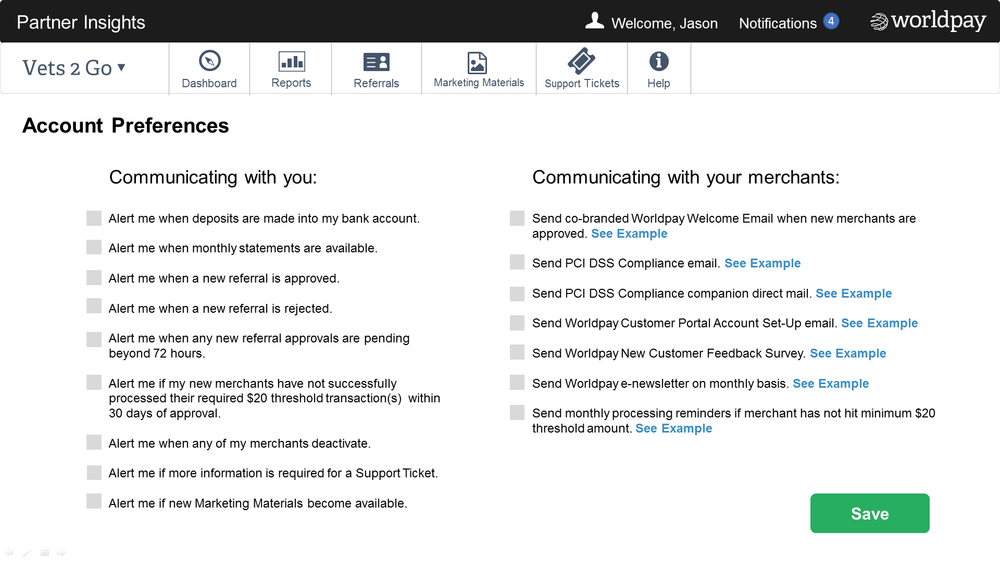
Settings page feedback explored clarity of sections, willingness to read them, desire for default preferences, and any missing options.
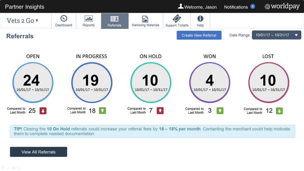
Referrals page feedback examined users’ understanding of page content, interpretation of statuses, points of confusion, and reactions to the ‘tip!’ message.
Merchant details feedback explored how users interpret the page, interest in viewing specific companies, and actions they’d take if merchant data appeared incorrect
Conclusion
We successfully ran a GV Design Sprint, but the project was halted in January 2018 after Worldpay’s acquisition by Vantiv.