Accessibility &
Responsive Design
Here are a few examples of how I mark my final designs with accessibility and viewport guidance to make sure they work across multiple screen sizes and devices.
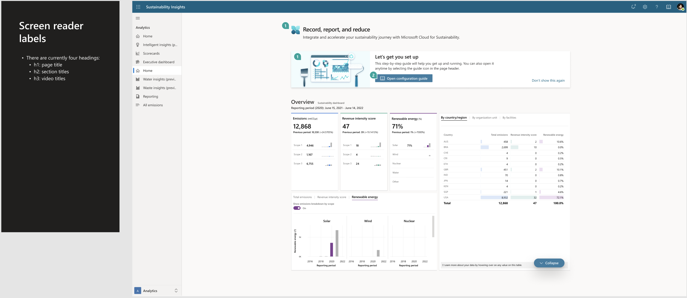
Accessibility
As a design leader, creating accessible, WCAG-compliant designs is essential to ensuring that every user—regardless of ability—can successfully interact with a product.
Accessibility isn’t just a compliance requirement, it’s a core part of building inclusive, trustworthy experiences. In my design process, I not only apply WCAG principles (color contrast, keyboard navigation, screen reader compatibility, etc.), but I also mark up my designs with clear accessibility guidance. This provides developers with explicit direction on how to implement accessible interactions, ensuring that accessibility is built in from the start rather than treated as an afterthought.
Web Examples


Mobile Examples


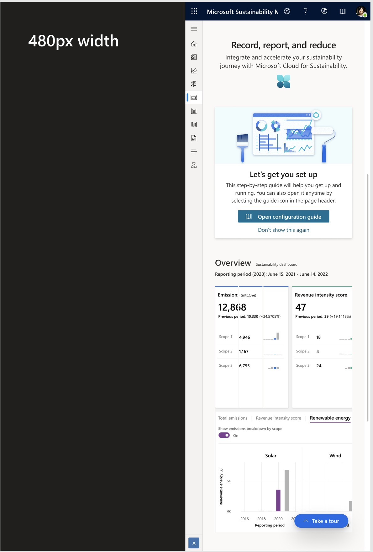
Responsive Design
Designing for multiple viewports and screen sizes is critical to delivering consistent, usable experiences across devices. As a UX designer, I ensure that layouts, interactions, and visual hierarchy adapt seamlessly from desktop to tablet to mobile.
To support development teams, I create and annotate responsive design variations that show exactly how each screen should scale or adjust. By passing these reflow designs along with clear specifications, I help ensure that the final product meets user expectations, regardless of the device they’re on.
Web Browser Breakpoints


Mobile Breakpoint
400% Zoom
Tablet Breakpoint
