Digital Banking - Bill Pay
NCR | 2021
Led UX design and research for a bill pay redesign that our Financial Institution customers and partners could use as a white-labeled solution.

Project Overview
Title: Digital Banking - Bill Pay
My Role: UX Lead/Manager
Team: Product Managers, Dev/Engineering Team, Jr. Designers & Researchers
Duration: 6 months
Impact: Conducted initial rounds of research and created an initial redesigned Bill Pay experience for our Financial Institution customers and partners

Context & Problem Definiton
Background: Bill Pay usage is declining ~10% annually, creating a retention risk for financial institutions. As a “sticky” feature tied to customers’ core finances, its decline weakens engagement and loyalty.
Target Users: Financial institutions - banks and credit unions
Problem Statement: How might we create a redesigned Bill Pay experience that reverses declining usage, strengthens customer retention, and helps financial institutions (FIs) - that use our white-labeled product - stay competitive against emerging digital-first banks?
Constraints: Creating an experience that met the differing needs of several banks and credit unions
Research & Discovery
Methods: Competitive Analysis, Literature Review, SME Workshops, Interviews
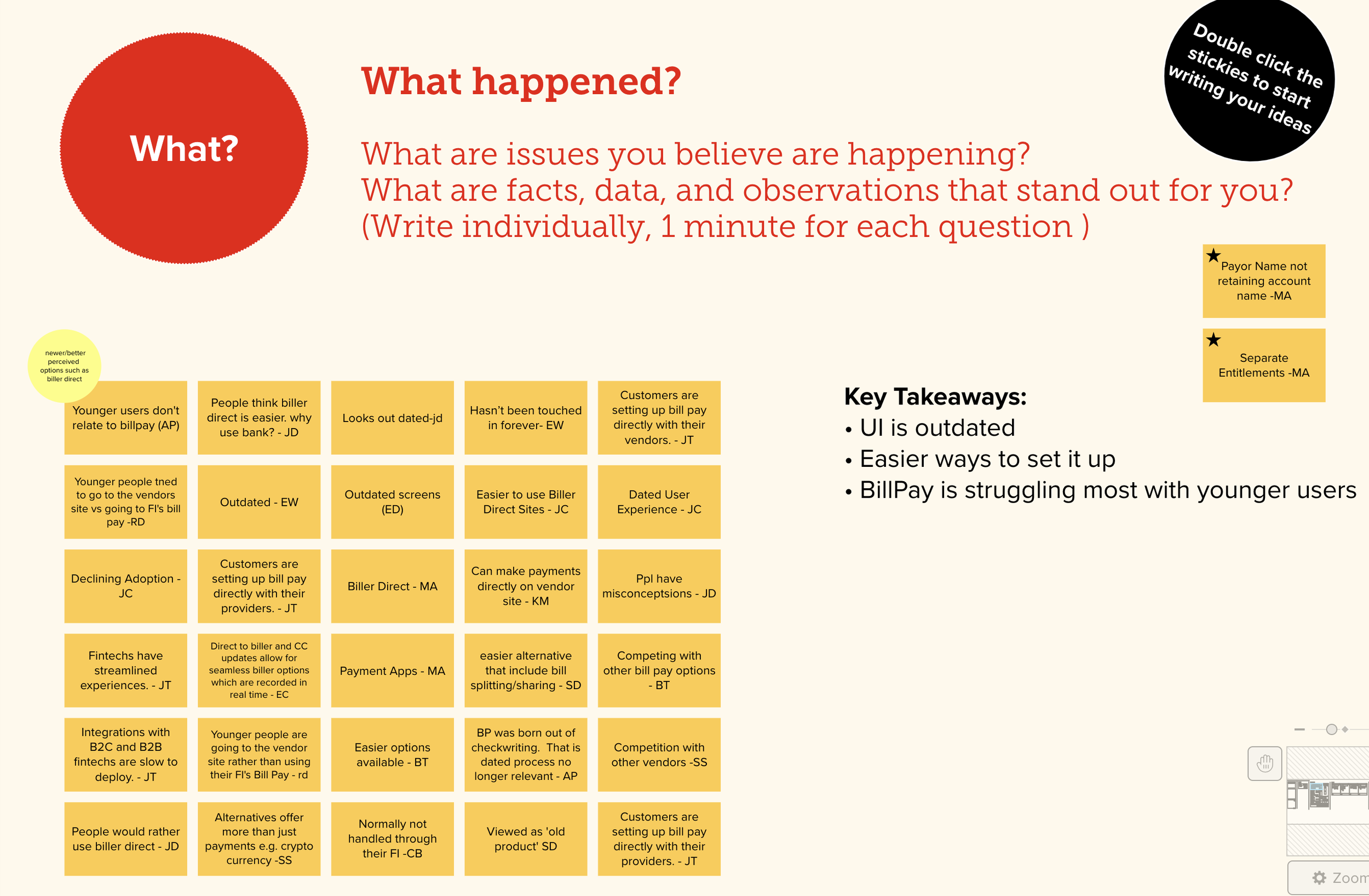
Key Insights: Using Bill Pay isn’t as easy and intuitive as customers need
Impact on Direction: Allowed me to pick an area to focus on for the redesign
Built a UX strategy around answering the following:
How can a redesigned Bill Pay experience help Financial Institutions engage and retain customers?
How can we modernize and simplify the Bill Pay experience so more customers can easily engage with it?
To address the ambiguity of the Bill Pay redesign, I applied a layered research strategy—competitive analysis, literature review, SME workshops, and information architecture benchmarking.
This approach framed the problem space broadly, validated it against industry trends, and grounded the design direction in both customer and institutional perspectives.
The result was a clear, evidence-based UX strategy that defined the core requirements for a modern Bill Pay experience and aligned stakeholders around a shared vision, ensuring design decisions were customer-centered and positioned to strengthen retention and engagement for financial institutions.
Competitive Analysis
I began with a competitive analysis across credit unions, large banks, and online-only providers. Despite their differences, most bill pay experiences looked the same. None offered true innovation.
View the complete competitive analysis here.
I organized the competitive analysis into the following focus areas so I could properly evaluate key features across the 10 competitors and their web and mobile experiences:
Access to Bill Pay feature from home screen
Bill Pay home screens
Calls to Action (CTAs)
Sending money to a recipient
Selecting the date to pay the bill
Paying the bill
eBill feature


Information Architecture Benchmarking
By analyzing how competitors structured their Bill Pay homepages, I identified three “table stakes” features: quick-add recipients, upcoming payments, and recent transactions. These findings directly shaped the redesign’s core information architecture and interaction patterns.

Literature Review
I reviewed industry research on emerging digital banking trends to align the redesign with evolving customer expectations. This ensured the solution not only addressed current needs but remained competitive and future-ready.
Technology Trends
What technologies are customers interacting with on a daily basis?
Is there room for Bill Pay to be integrated into any of these?
Business Trends
What are the trends our FI customers are following in order to compete and gain market share?
Customer Trends
What are customers currently doing in terms of paying bills, sending money, money management, etc?
How does Bill Pay fit into all of this?
Socioeconomic Trends
What broader cultural forces are impacting our customers?
What factors relating to race, income level, etc. make Bill Pay less accessible to certain groups of people?
SME Workshops
I facilitated four workshops with 21 participants across product, design, training, and FI support teams. These sessions surfaced first-hand insights into customer pain points and internal challenges, grounding the redesign in diverse, practical perspectives.
Admin SMES
Perspective on what information admins control in the backend
Business SMES
Worked with them to discuss changes in the consumer app that might later affect the rollout
Consumer SMES
Worked with them to understand immediate needs
FI Representatives
Understanding the issues they’ve had over the years and why


FI Interviews
Building on the SME workshops and NCR’s internal perspective, I conducted interviews with eight financial institutions to gather direct input. These conversations focused on understanding what their end-user customers were saying about current Bill Pay experiences. My interview guide explored four key categories:
The sign-up experience
Date selection for sending payments
Online bills (eBills)
Account balances
These interviews validated key problem areas, revealed gaps not captured in earlier research, and ensured that the Bill Pay redesign was shaped by both customer pain points and the operational realities of financial institutions.

Themes & Design Process
Following the research cycle, I synthesized insights into five key themes and translated them into actionable user stories to guide design and development.
*User stories that got incorporated into my proposed design are highlighted
Customers expect a modernized Bill Pay experience
As a user, I want an experience that reflects how I already manage money in my daily life, so it feels intuitive and easy to adopt.
As a user, I want tools to organize and manage my payments, so I feel confident and in control of my finances.
As a user, I want a responsive interface, so I can seamlessly access and use the experience on any mobile device.
As a user, I want a personalized experience that adapts to my financial situation and habits, so the service feels relevant and supportive.
Customers choose Bill Pay only if it’s simpler than paying billers directly
As a user, I want a conversational setup experience that guides me step by step, so I feel supported and confident from the start.
As a user, I want the setup process to be as quick and simple as biller direct, so I can begin using Bill Pay with my financial institution without unnecessary effort.
Customers want an intuitive experience that educates them
As a user, I want a clear and consistent Bill Pay experience that provides transparency, so I can both learn from it and build trust with my financial institution.
Current Bill Pay lacks financial wellness features
As a user, I want clarity on which bills are most important so I can effectively prioritize my payments.
As a user, I want tools to help me track my payments and understand my account balance.
Customers are concerned about their sent payments not arriving on time
As a user, I want clear guidance on how and when to send payments so I can be confident they will arrive on time.


Final Solution
With a clear strategy in place, the next step was translating research insights into actionable design. I began by mapping user journeys and pain points to frame opportunities, then developed concept sketches and wireframes that reflected both customer needs and institutional requirements. Each design artifact was created to build alignment — first as lightweight explorations to spark discussion, then as high-fidelity prototypes to demonstrate how the redesigned Bill Pay experience could function end-to-end.
