MSM - Reporting & Analytics
Microsoft | 2021-2023
I owned the design direction for MSM’s Reporting & Analytics experience to streamline workflows, improve clarity, and prepare for future compliance standards. I partnered with PMs, Engineers, & Data Scientist.
Context & Challenge
Users lacked transparency in reporting periods.
Report creation was inefficient and duplicative.
UI inconsistencies reduced trust in reporting accuracy.
Impact
Reduced time and effort: Enabled customers to generate more detailed reports in half the time.
Elevated team knowledge: Presented MSM Reporting & Analytics design rationale and roadmap at MC4S Day of Learning and XR Review, increasing cross-team understanding and shaping leadership feedback.
Improved user clarity & control: Designed experiences for reporting years, naming conventions, period start/end visibility, and status management (“open,” “in review,” “closed”)—giving users more transparency and control.
Streamlined report preparation: Successfully launched Report Preparation Enhancements (Apr 2023), enabling users to include multiple data categories in a single report—saving time, reducing duplication, and supporting more detailed reporting.
Future-proofed designs: Anticipated long-term needs by incorporating Water and Waste categories, preparing for CSRD compliance, and aligning reporting workflows across teams.
Strengthened product polish & usability: Collaborated with engineering through detailed page reviews to ensure reporting experiences were consistent, pixel-perfect, and data-rich.
Increased design and operational excellence: Proposed streamlined redesigns, hosted wall reviews to refine visuals, and used out-of-box UCI components (e.g., Restatements) to accelerate development and reduce engineering effort required with custom components.
Expanded feature set: Designed the “Data Archival” capability within existing reporting frameworks, enhancing discoverability by extending familiar menus and status options.
Supported customer success: Partnered with PM and engineering to rapidly iterate for BBC demos, ensuring MSM could meet customer requests beyond standard reporting features.
Final Solution
Data Dashboards
Turning complex environmental data into actionable insights so users can easily track and understand their emissions data to improve their organization’s sustainability efforts.
Data Archival
Streamlines the user experience by keeping workspaces clean and focused while preserving historical records for trust, compliance, and easy access.


Restatements
Report restatement updates published reports to fix errors or add new data. By making corrections transparent and clear, it builds user trust, reduces confusion, and ensures confidence in data accuracy.


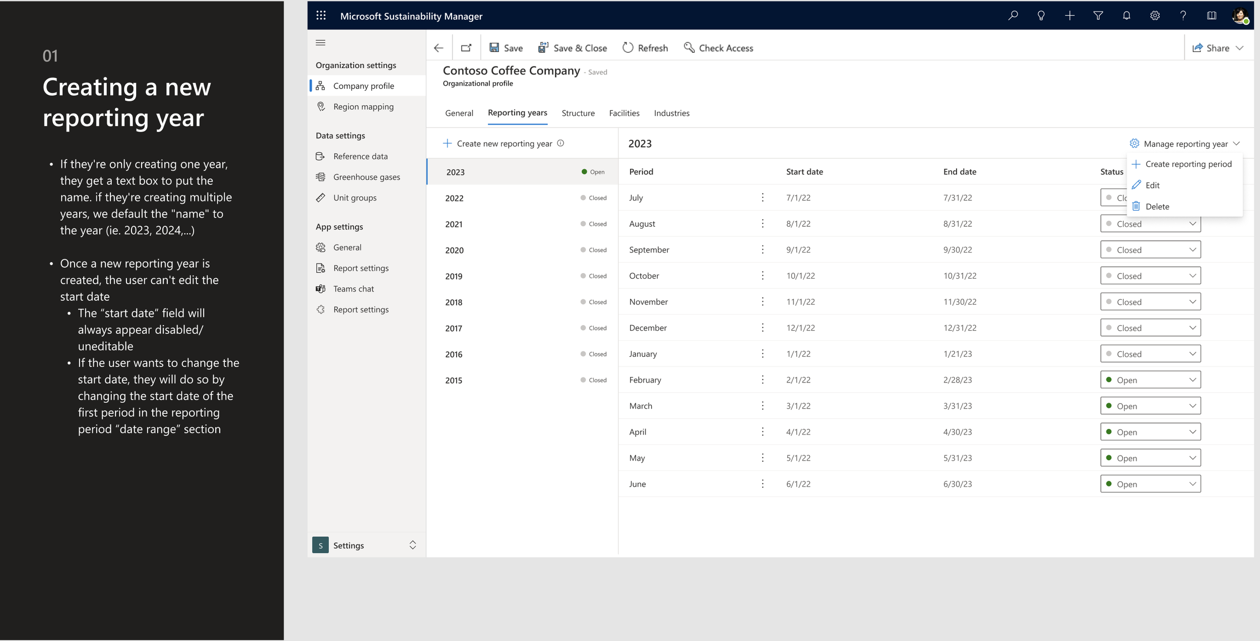
Reporting Period Definition
Reporting period definitions set the timeframes for organizing data, giving users clarity, consistency, and trust in insights so they can make confident decisions.


This interface exemplifies how I design for analytics maturity — connecting data quality, insight transparency, and user confidence. The progress dashboards and AI Copilot integration transform ESG reporting from static documentation into a living, data-driven experience.
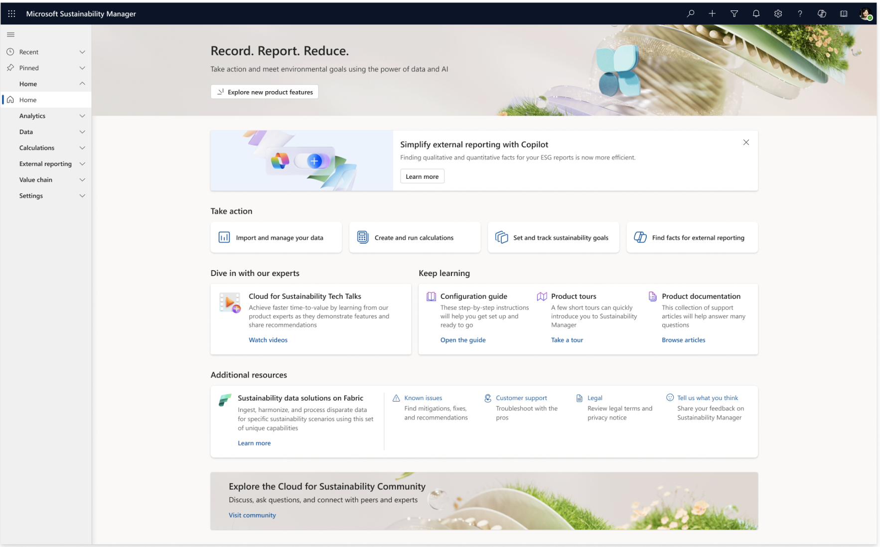
This home interface encapsulates how I design analytics ecosystems: guiding users from data ingestion to insight generation with clarity and confidence.
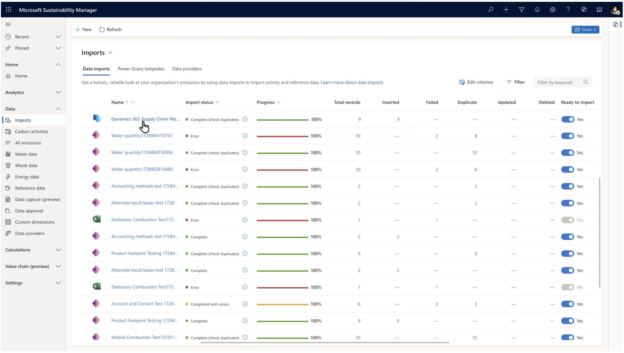


This import dashboard reflects how I think about designing analytics ecosystems — where trust starts at the data layer. By giving users visibility into data readiness and quality, we empower them to make decisions confidently downstream.
This analytics dashboard represents how I design for clarity and confidence in data. The goal was to help sustainability leaders not just see the numbers, but understand what they mean and where to act next.
This What-If scenario experience demonstrates how I design for insight clarity and confidence. It empowers sustainability officers to model outcomes — like switching from air to rail travel — and immediately see the environmental impact.
This What-If Analysis experience illustrates how I design for decision-making clarity — blending predictive analytics, comparative visualization, and contextual guidance.
Users can adjust parameters, see projected outcomes, and confidently act on insights.
This predictive analytics experience illustrates how I design for clarity and confidence in decision-making. It empowers sustainability leaders to test operational changes — like shifting transport modes — and immediately understand the impact on emissions and cost.
This dashboard embodies how I design for insight-driven storytelling. It connects predictive analytics with actionable insights and measurable goals — so sustainability leaders can understand both why something is happening and what to do about it next.
This screen highlights how I design for data trust and transparency — ensuring the analytics layer stands on a verified foundation.
Every insight starts here: clean, validated data imported from trusted systems.
This interface illustrates how I design for scalability and trust in analytics systems.
Here, the focus isn’t just on visualizing data — it’s on building the foundation that ensures those insights are accurate and credible.